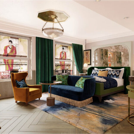
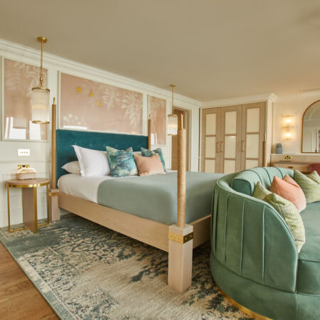
Our eclectic design concept for this boutique hotel combines hints of luxury with elements of nature, in a nod to Chelsea’s past and present.
Our client acquired The Sloane Club in 2017 – a private members club with many separate common areas, meeting and bedrooms. We were instructed to divide, remodel and redesign the large five-storey red-brick Victorian building to create brand-new stand-alone venture, Sloane Place, to sit alongside the club.
Sloane Place is a 27-bedroom boutique hotel, café-bar and restaurant. Adjoining The Sloane Club, the hotel is open to members of the public as well as club members. Work on project began in February 2018 and was completed in May 2019.
The scope of works
From the original building and club, around 30 bedrooms were allocated for the hotel, alongside smaller underutilised meeting rooms. We remodelled, renovated and refurbished the space, creating 15 bedrooms with ensuite bathrooms, 13 luxury suites, a multi-functional café-bar-restaurant and lower ground floor bar.
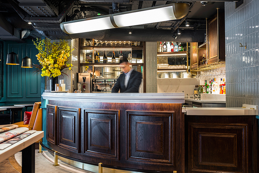
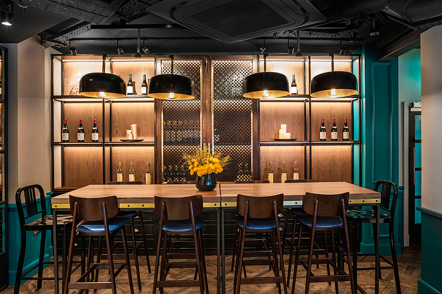
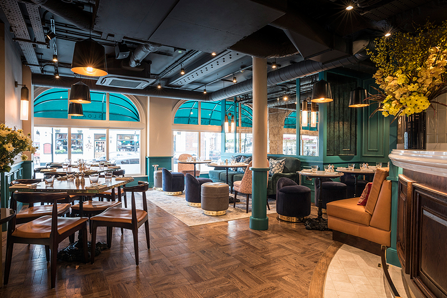
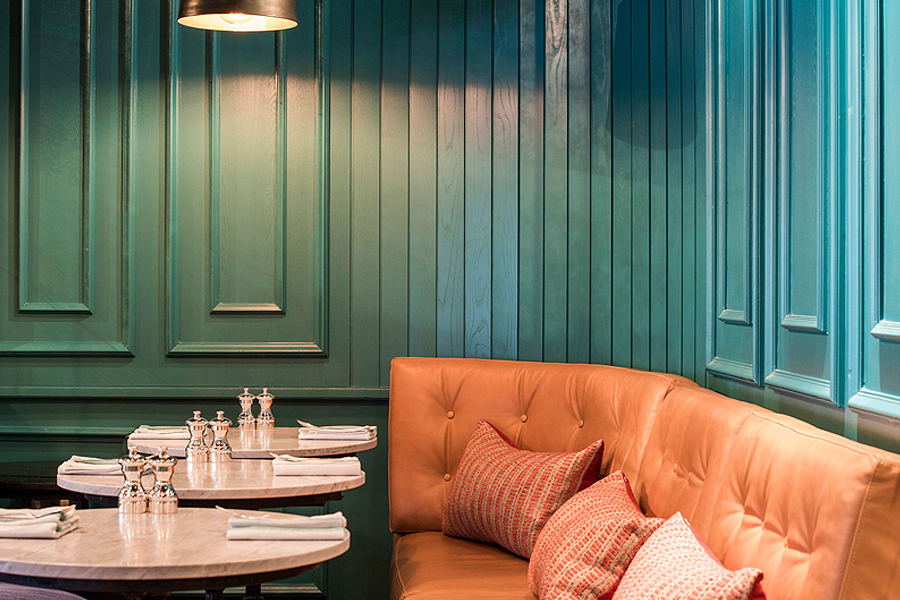
The 50-seat café-bar required extensive structural works to open it up, making it more accessible for guests and local clientele alike. The interior design scheme combines bold teals, timber panelling, glass and brass, maximising light and space.
A focus on food and drink
With the combination of informal décor and an all-day dining menu courtesy of Executive Chef Bernhard Mayer (formerly The Savoy, Four Seasons Park Lane Hotel), guests and patrons are encouraged to relax and extend their stay.
Food is also served in the lower ground floor cocktail bar, plans for which were confirmed part-way into the initial project. With an evolving concept, it’s a light, bright space for guests to relax and enjoy an all-day dwelling experience.
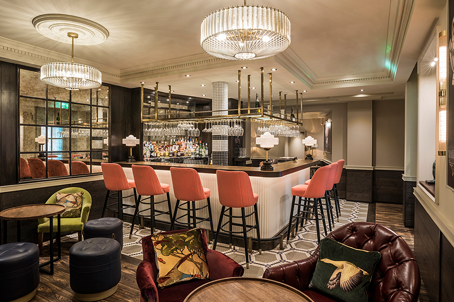
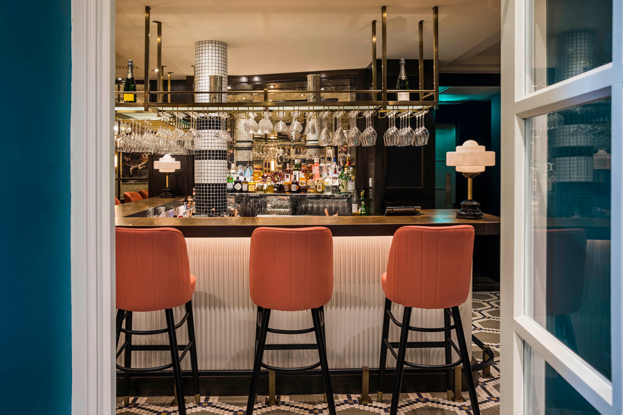
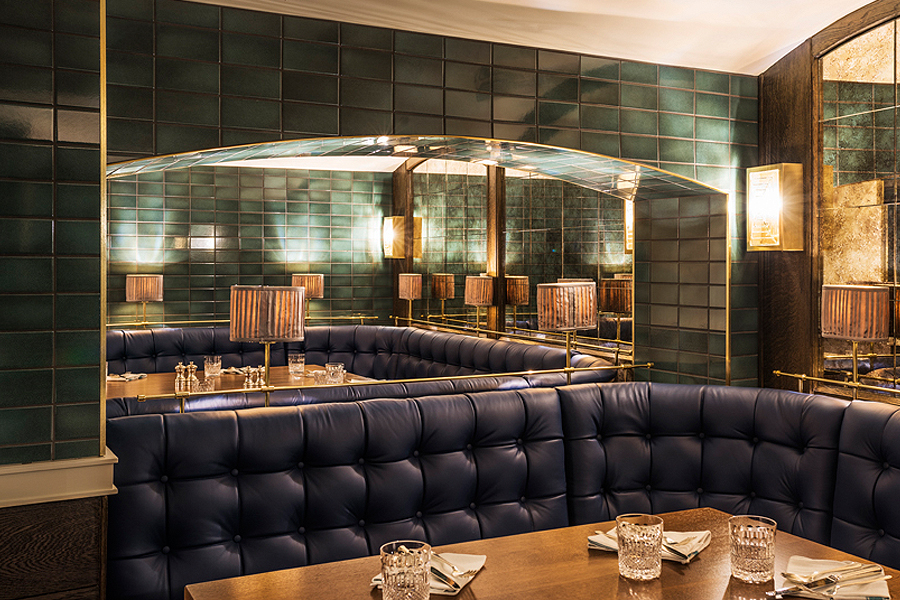
Seating up to 50 guests, the cocktail bar acts as a continuation of the ground floor café-bar with elements of the décor following through but with added opulence. The stunning high-gloss fluted timber panelled bar is copper topped and backed with antiqued mirrors. The bar also boasts dentils and a vaulted dining area with faceted glass hanging pendant lighting.
A brand connected to place
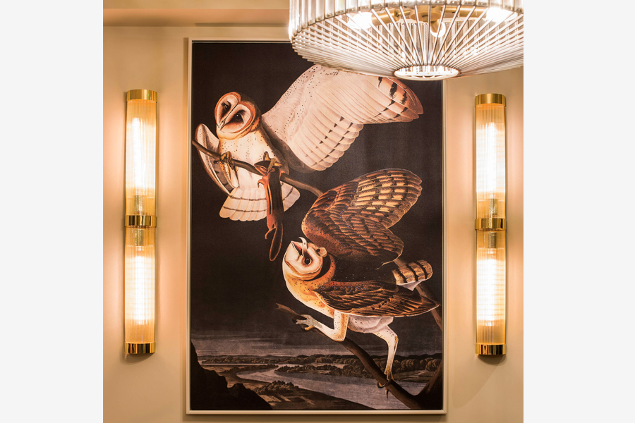
The interior décor and evolution of the Sloane Place brand work together harmoniously, with hand-drawn Brush of Broom designs featuring within the décor across the three main areas and in the new logo. This is a nod to the heritage of the area; for centuries the Broom bush grew in abundance on site and features at the top of the Kensington and Chelsea coat of arms.
The hotel design and décor
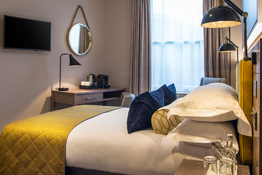
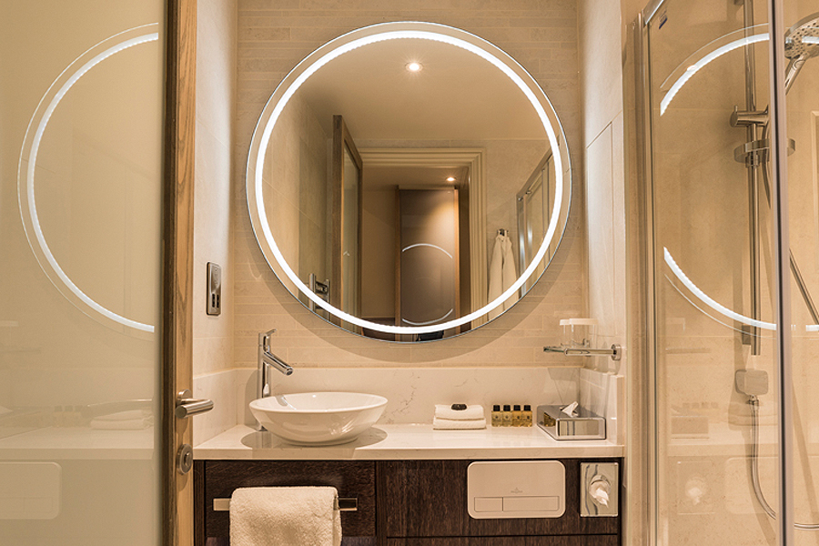
The hotel bedrooms fall into three categories: Cosy (14-17 sqm), Classic (18 sqm) and Suite (38 sqm). All boast ensuite bathrooms, comfortable Hypnos beds, WiFi, mini kettles and Nespresso machines and a small writing desk.
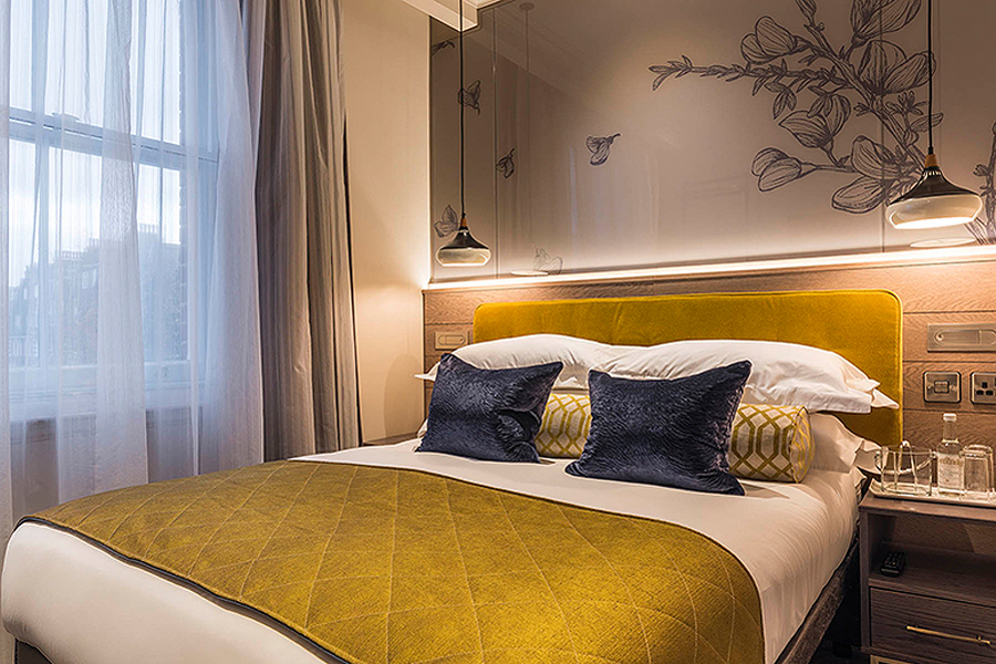
Bedroom décor consists of warm grey timber panelling to evoke a sense of warmth and comfort, complimented by luxury statement blue and yellow fabrics as seen on velvet headboards, bolsters, blankets and scatter cushions. All furniture items are bespoke, with high gloss light-reflecting surfaces, designed to make the best use of space.
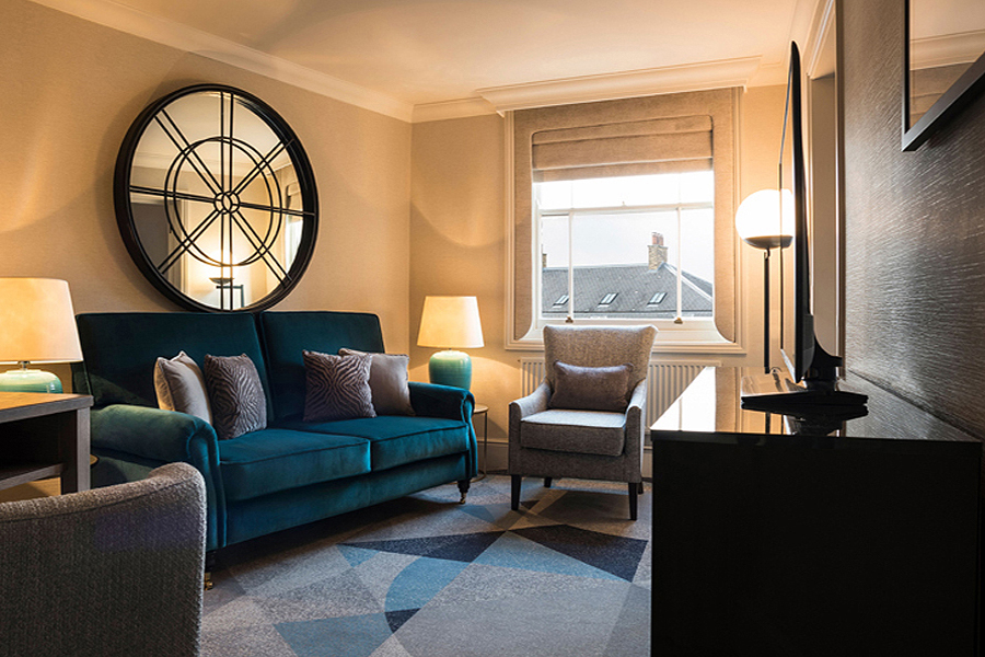
Thick wool carpets have a large-scale geometric pattern – a bespoke design by our director Simeon Thompson. Together with black metal wall and desk lamps they lend a contemporary flair, with a generous use of mirrors to enhance the sense of space and light. According to an article in Business Traveller, the overall effect is “smart, stylish and deeply comfortable”.
Overall the design, décor and concept promise a luxury venue for guests and the general public to feel welcome to enjoy from day to night.
Reviews feature on East London Girl, The London Musings, Lux Life London, Kings Road Rocks and FashionBite.
Date
14 April 2020

